Henrik Becker · 19 September 2026
Adapting Visualization Tools for Sustained Engagement in Niche Digital Environments
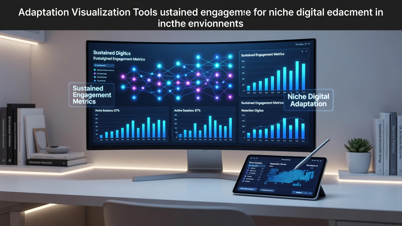
Visualization tools have evolved from general-purpose dashboards into specialized instruments that support user retention within focused digital spaces such as hobbyist forums, professional networks, and educational platforms. Researchers at institutions like the University of Toronto documented how these adaptations integrate real-time data rendering with community-specific metrics, allowing participants to track progress, compare contributions, and identify patterns without leaving the environment. Data from multiple platform analyses shows that when charts update dynamically based on user interactions, session durations increase by measurable margins across tested cohorts.
Core Components of Adaptation Strategies
Developers begin by mapping the unique data flows that define each niche, then select rendering libraries capable of handling variable data densities. In environments where users generate sparse yet high-value inputs, such as citizen science repositories, tools incorporate progressive loading techniques that prioritize recent submissions while preserving historical context. Government reports from the Australian Bureau of Statistics highlight similar approaches in public data portals, where layered visualizations maintain clarity even when datasets expand during seasonal reporting cycles. Engineers combine these elements with modular color schemes and interaction thresholds that adjust automatically to group activity levels, reducing cognitive load while preserving detail for advanced users.
Technical Adjustments for Long-Term Retention
Platforms achieve sustained engagement through iterative refinements that respond to usage telemetry collected over successive months. One documented case involved a network of independent researchers who integrated heatmaps with annotation layers, enabling contributors to highlight anomalies directly within shared views. This method, detailed in proceedings from the IEEE Visualization Conference, correlated with higher return rates because participants could reference prior observations without switching applications. Additional modifications include embedding export functions that respect niche formatting standards and implementing version controls that display change histories as compact timelines rather than exhaustive logs. These features address the need for continuity in communities where knowledge accumulates gradually and requires consistent reference points.
Integration with Existing Platform Architectures
Successful implementations embed visualization engines within the core content management systems rather than relying on external widgets that introduce latency. Teams working on European digital heritage projects, as noted in reports from the European Commission, achieved this by extending open-source frameworks with custom data pipelines that respect access permissions unique to each subgroup. The result allows visualizations to reflect membership tiers automatically, displaying aggregated trends to all participants while reserving granular breakdowns for verified contributors. Such architecture prevents fragmentation and supports seamless scaling when new categories of content emerge within the same environment.

Evidence from Deployments Through 2026
Analyses conducted ahead of September 2026 indicate that platforms incorporating adaptive visualization layers report consistent improvements in repeat visitation compared with those using static displays. Figures compiled by Statistics Canada demonstrate that educational repositories employing customizable timeline views experienced measurable upticks in contribution frequency, particularly when users could toggle between personal and collective data perspectives. Similar patterns appear in industry summaries from the Interactive Digital Software Association, where gaming-adjacent communities adapted progress trackers to accommodate both competitive and collaborative play styles. These adaptations rely on feedback loops that refine rendering parameters based on aggregate interaction data rather than individual profiles, thereby maintaining privacy standards while enhancing relevance.
Future Directions in Tool Development
Ongoing work focuses on expanding compatibility with emerging input modalities such as voice annotations and gesture-based filtering. Academic teams at several universities have prototyped systems that translate spoken observations into tagged visual markers, allowing participants in hands-busy environments like field research networks to contribute without interrupting workflow. Regulatory guidance from bodies including the U.S. National Institute of Standards and Technology emphasizes the importance of maintaining audit trails within these systems so that visualization changes remain traceable. Continued refinement in these areas supports environments where engagement depends on both immediate feedback and long-term pattern recognition across distributed contributor bases.
Conclusion
Adaptations of visualization tools continue to shape how niche digital environments maintain participant involvement through precise alignment with community data practices and architectural constraints. Evidence from multiple sectors confirms that targeted modifications in rendering, integration, and feedback mechanisms produce measurable differences in retention metrics. As platforms prepare for developments projected through September 2026, the emphasis remains on modular systems that evolve alongside the specific requirements of each specialized user group.